Task
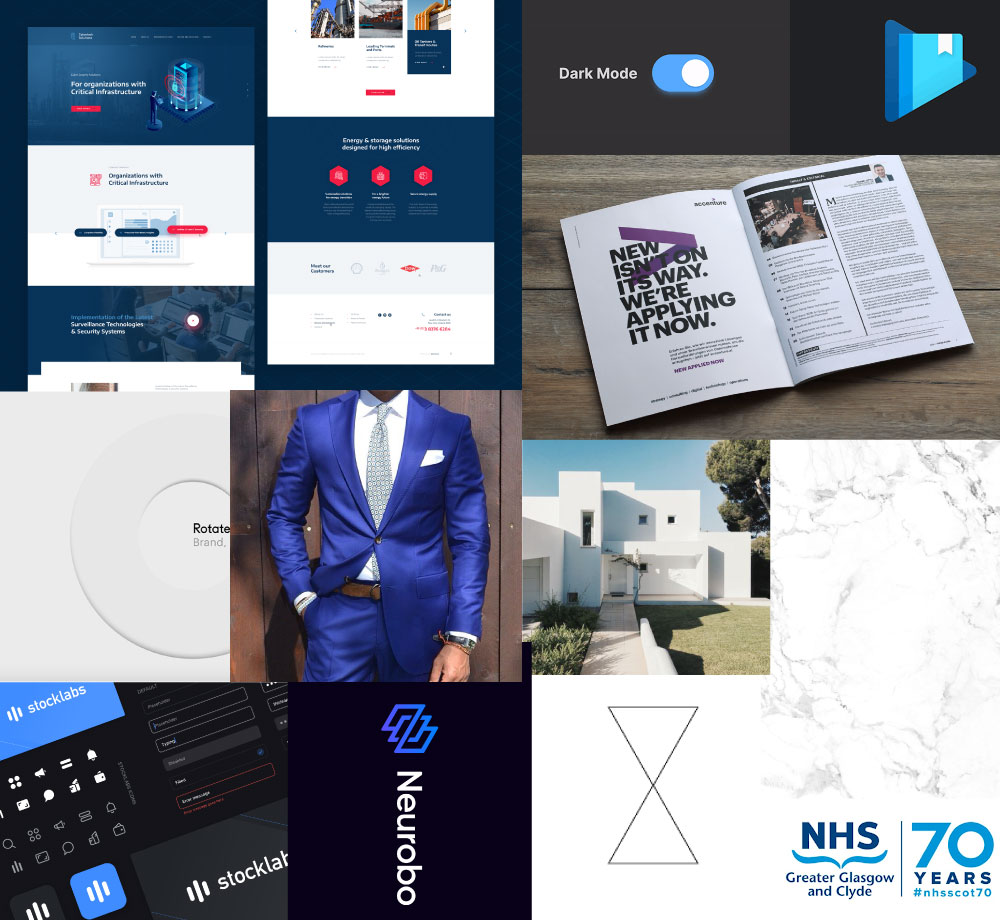
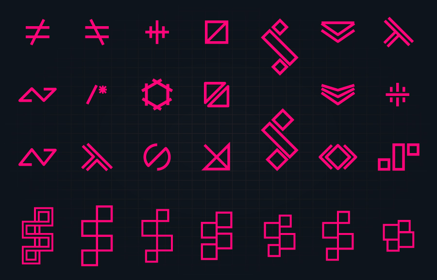
Tasked with reviving the current brand to align with how the business has developed over the years. This included new brand identity, imagery with the likes of photography, icon and new website which would funnel future software projects but primarily be used to help hire new applicants into the business.
Soultion
The direction taken in regards to the site design was to go with a modern corporate feel but split the site into two halves. The homepage would be the customer and business-facing part of the site using clean design, strong calming colours giving of a sense of security, trust and then maximise on whitespace as much as possible. The direction taken in regards to the site design was to go with a modern corporate feel but split the site into two halves.
The homepage would be the customer and business-facing part of the site using clean design, strong calming colours giving of a sense of security, trust and then maximise on whitespace as much as possible.
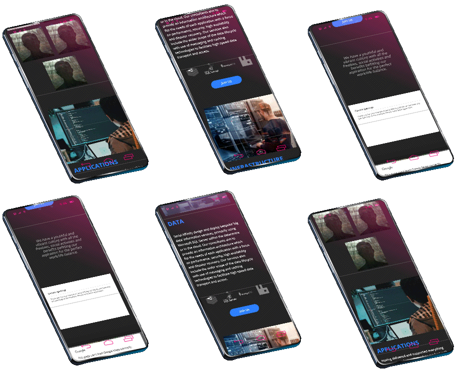
The other part of the site would be used for recurrent and targeted for developers across the entire code stack. There was a lot of discussions and mocks produced and in the end, it was decided that we should go with a dark theme which developers could relate to along with eye-catching icons, impactful imagery while still keeping the corporate blue aesthetic.

